Overview
These experiments are an independent, ongoing program of mechanistic interpretability research. The goal is to look inside trained transformer language models - not just measure their outputs - and recover the internal computations they actually perform.
Current threads include sparse autoencoder (SAE) feature extraction across layers, attention-circuit analysis on small/medium models, and feature-attribution probes that connect specific behaviors back to identifiable internal structure.
Themes
- Sparse Autoencoders (SAEs) - training overcomplete dictionaries on residual-stream activations to surface monosemantic features and study how they evolve across layers.
- Attention-Circuit Analysis - tracing how specific attention heads compose into interpretable circuits for narrow tasks (induction, indirect object identification, etc.).
- Feature Attribution & Probes - connecting model behavior on benchmarks back to concrete internal features, with an emphasis on probes that don't leak label information.
- Cross-Model Generalization - checking which internal features survive across architectures and scales, and which are artifacts of a single run.
SAE Experiments
Sparse Autoencoders (SAEs) are the workhorse of modern mechanistic interpretability - overcomplete dictionaries trained on residual-stream activations, aiming for sparse, monosemantic features. Everything below ties to a knowledge-distillation knowledge-distillation paper. The full image gallery (every variant + selection rationale) lives here.
Experiment 1 - Toy-Model Validation of the KD Theorem
Before any real LM, a controlled toy environment validates the KD minimum-width theorem: for a target sparsity, theory predicts the SAE dictionary width d*S at which reconstruction loss bottoms out. Toy data lets every quantity be computed in closed form, so we can check theory against ground truth without LM training noise. All three figures below appear in the paper.
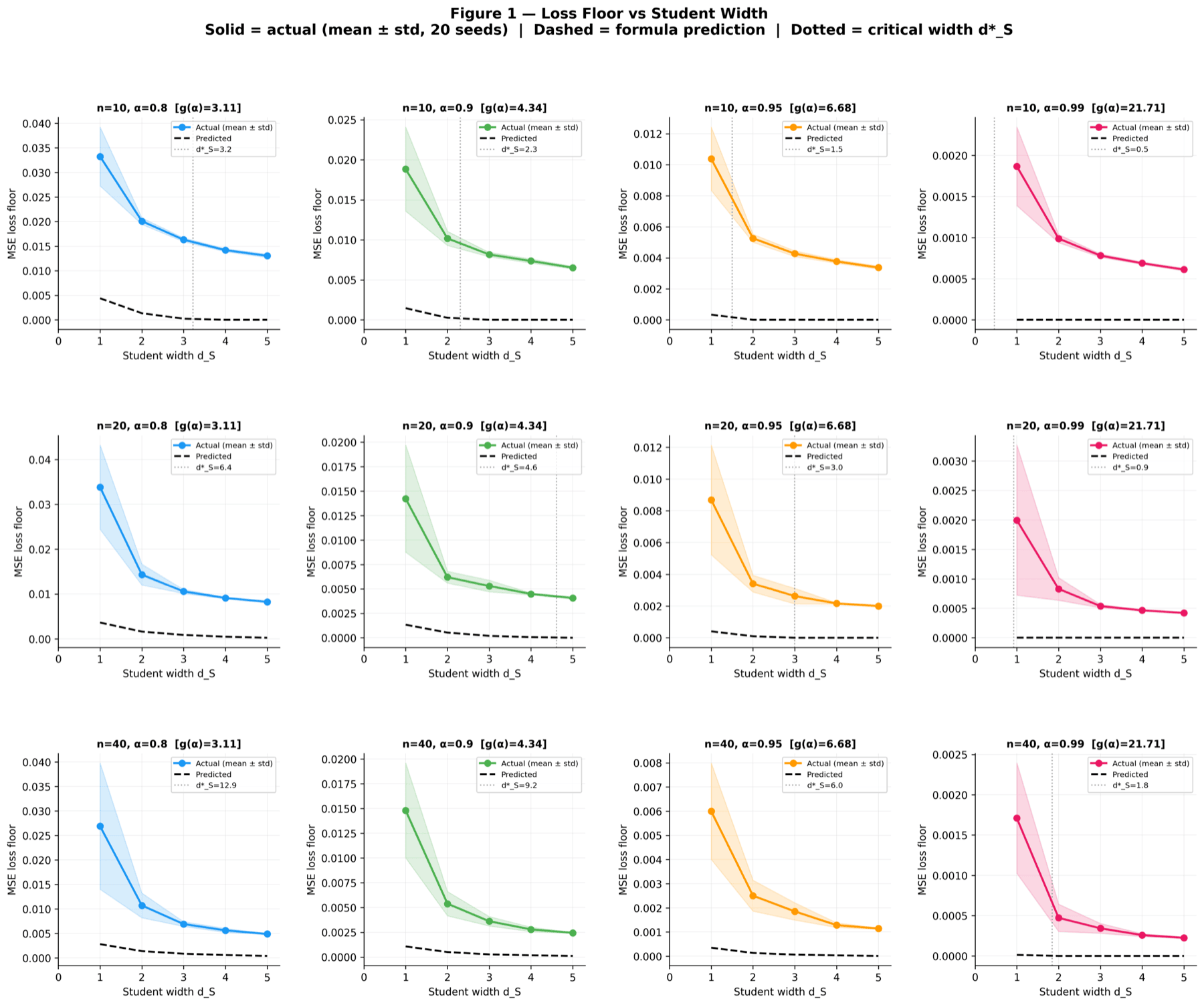
Each curve traces the reconstruction loss as the SAE dictionary width d_S grows, for a different (alpha, F) configuration. Theory predicts that loss hits a floor at the exact d*_S value, and the data agrees on every curve. This is the headline plot of the toy experiment because it shows the predicted minimum width is not just a tendency but a sharp transition.
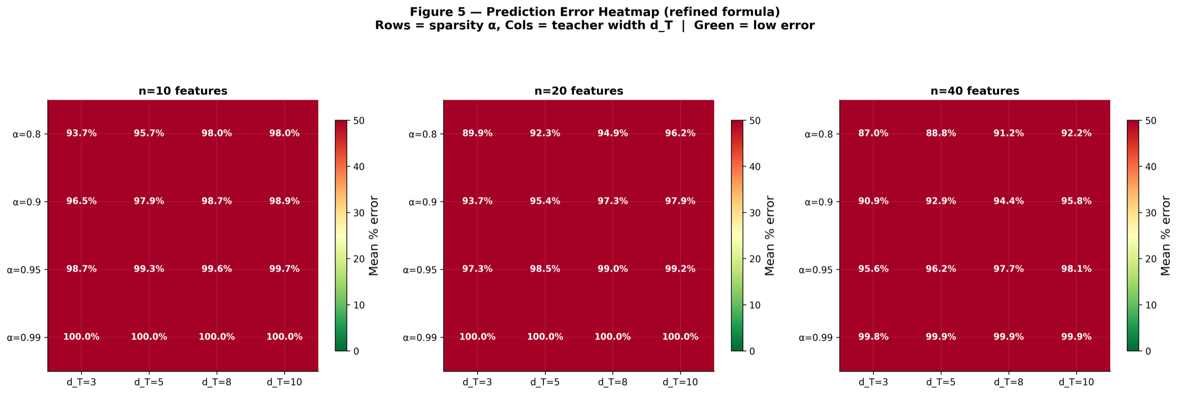
All (alpha, F) configurations on one canvas. Rows and columns sweep the two parameters; cell colour tells you how closely measured loss matches what KD theory predicted. Bright cells mean a near-perfect match. The point is to show the prediction holds uniformly across the parameter grid, not just on a handful of nice curves.
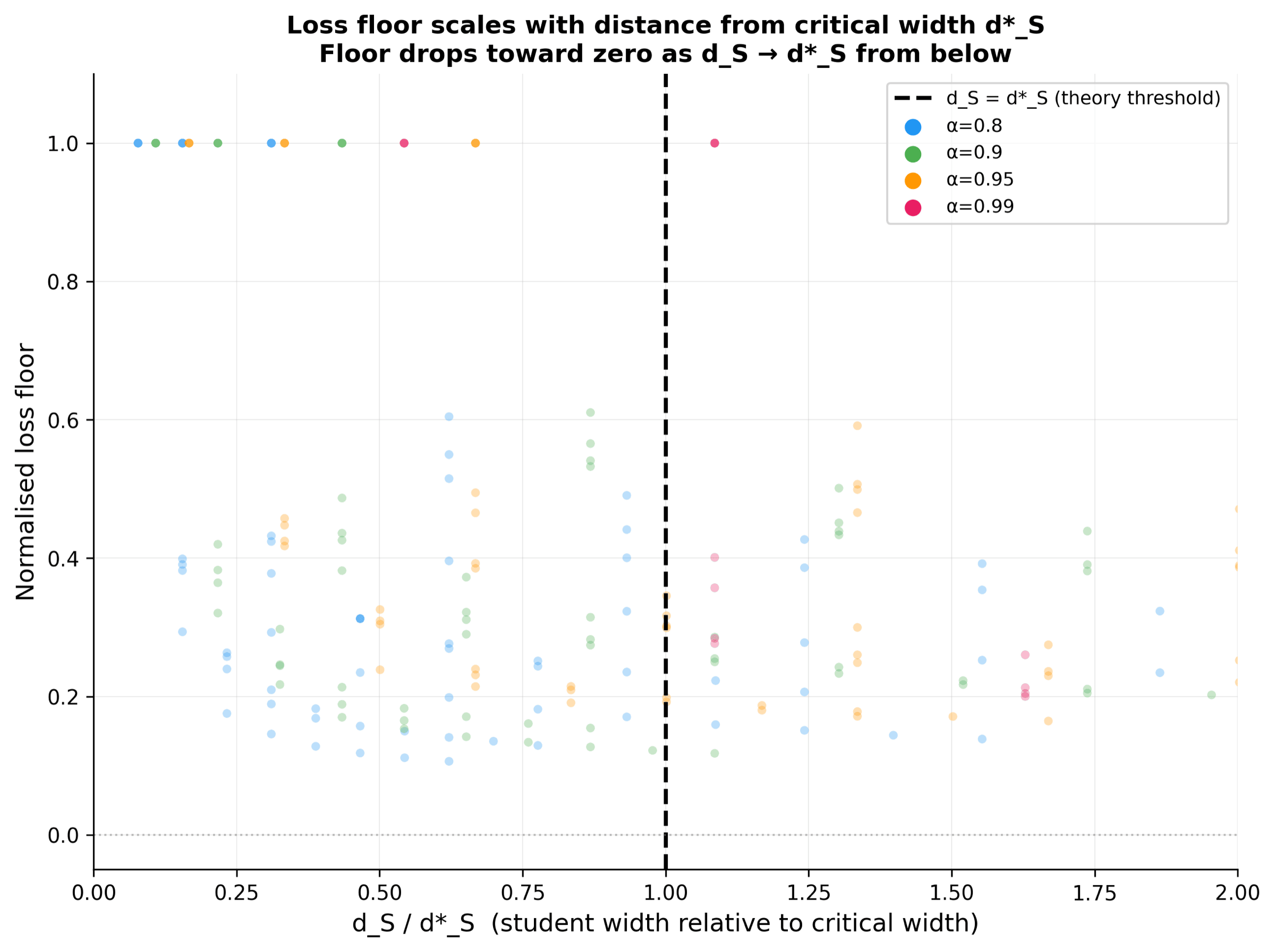
Every point compares the measured loss floor of a run to its theoretical d*_S value. If theory and experiment agree, the points sit on the y = x diagonal. They do. This single plot collapses the entire toy experiment into one image that says the theorem holds.
Experiment 2 - Real-LM SAEs on Pythia-410M
After the toy validation, the same predictions are applied to Pythia-410M residual-stream features. Each trial trains 24 SAEs (one per layer, dictionary F = 32,768) for 300 M tokens with checkpoints at 50 / 100 / 150 / 200 / 250 / 300 M tokens. Three trials sweep how the L1 sparsity coefficient is set:
Trial A - L1 = 3e-4 fixed (dense regime)
Looser-sparsity end of the sweep: features stay active across many tokens, almost nothing dies. Useful as a high-reconstruction baseline against which the sparser trials can be judged, but not the regime for monosemanticity claims - each feature still encodes too many things at once.
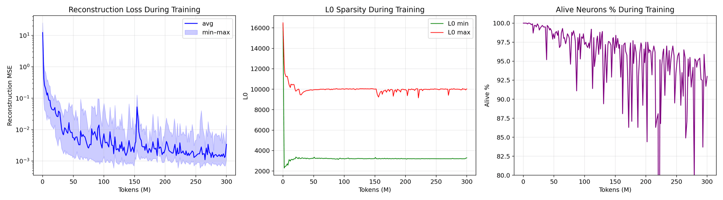
Reconstruction MSE, the L1 sparsity penalty, and the combined loss across all 24 SAE layers over 300 M training tokens. With L1 held loose at 3e-4 you get the densest activations (avg L0 around 6,184) and the best reconstruction. Each line is a layer, so the smooth simultaneous declines confirm no layer blew up.
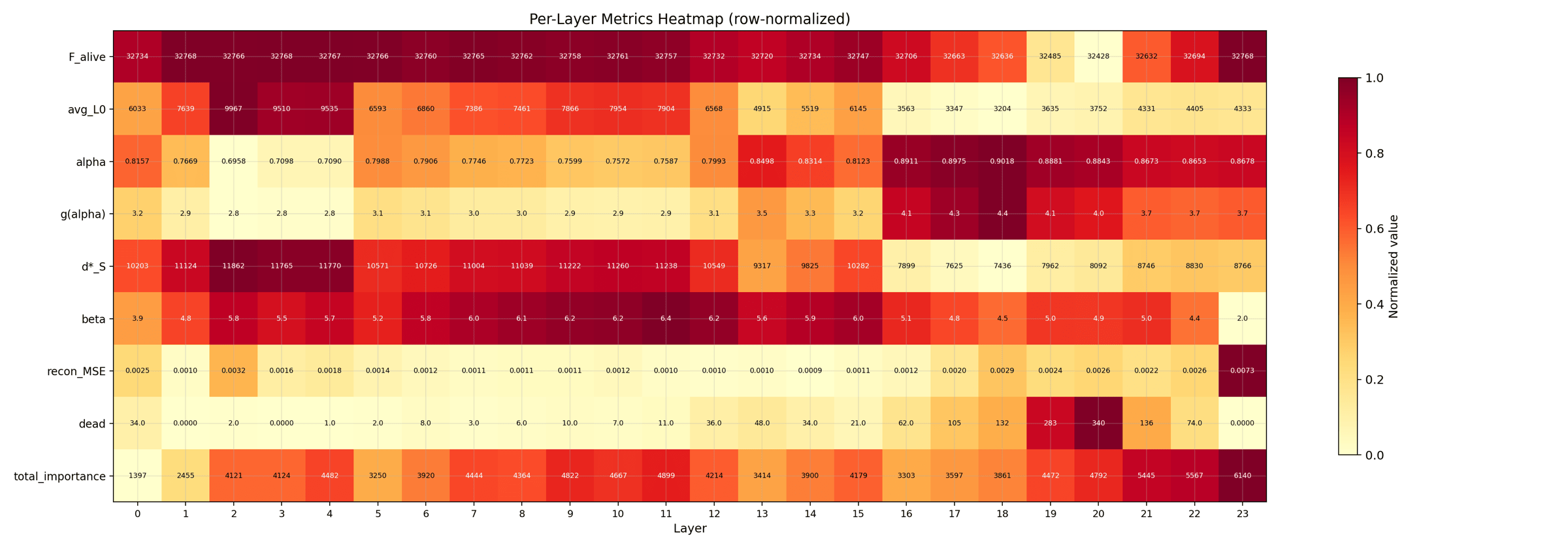
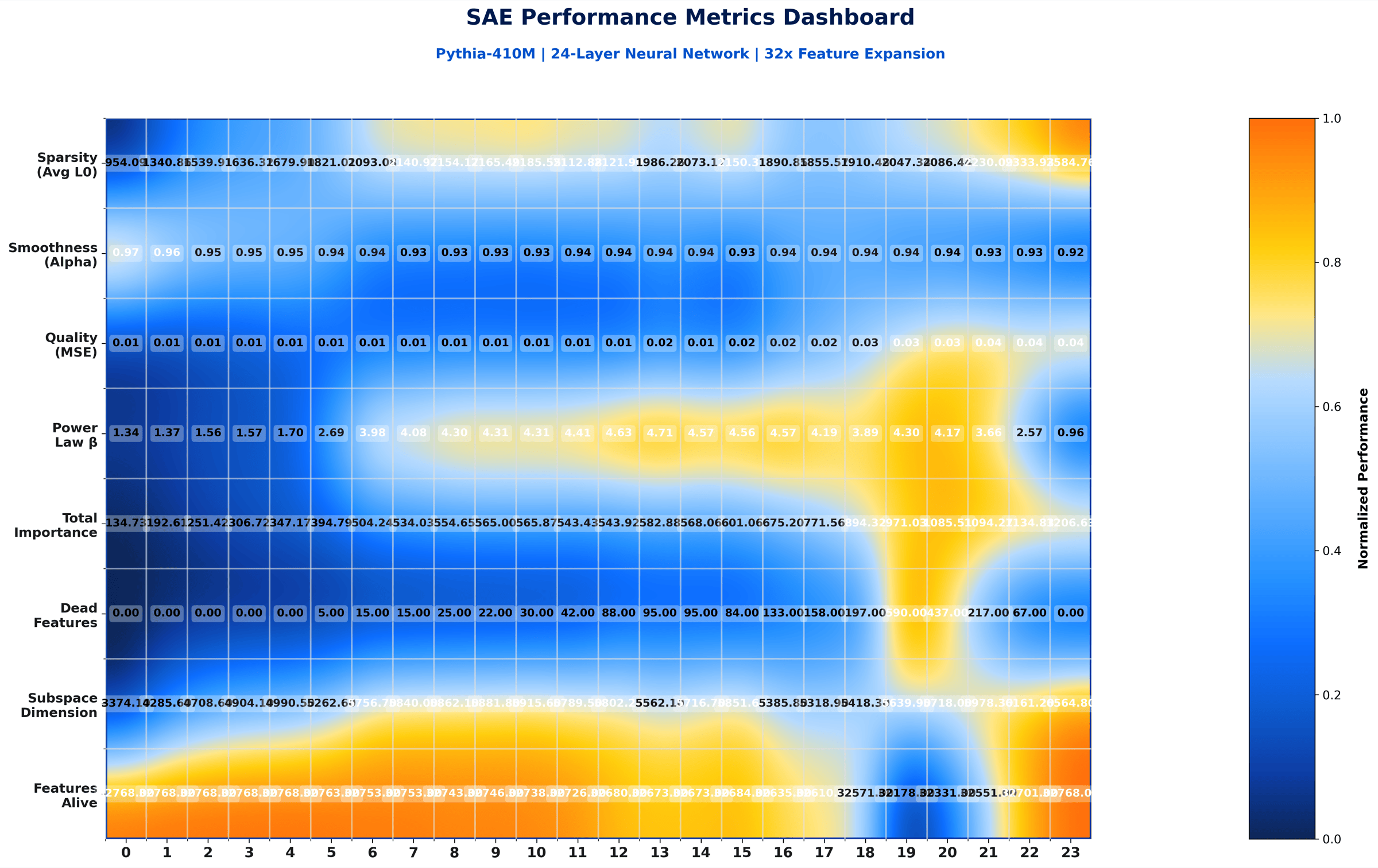
A compact summary card with one row per layer and one column per metric (L0, alpha, g(alpha), MSE, and so on). Shade tells you the relative value within the column. This is the at-a-glance shape of the whole trial.
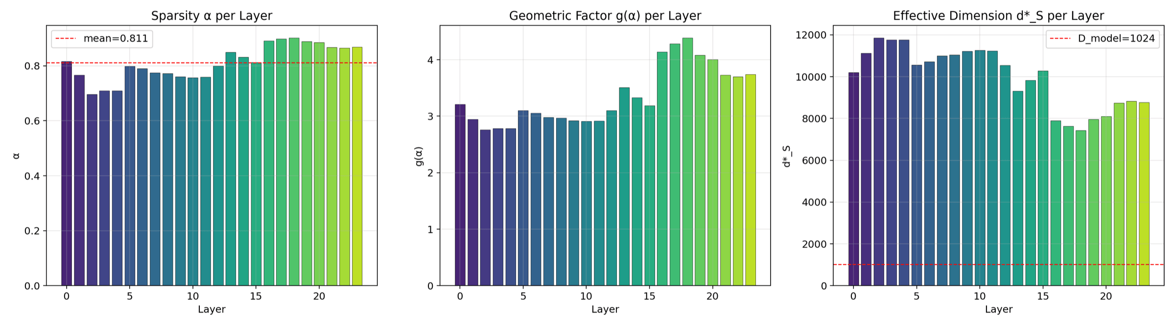
The three KD quantities plotted side by side per layer. Alpha measures sparsity, g(alpha) is the capacity function, d*_S is the predicted optimum dictionary width. These are the inputs theory needs to produce a width prediction.
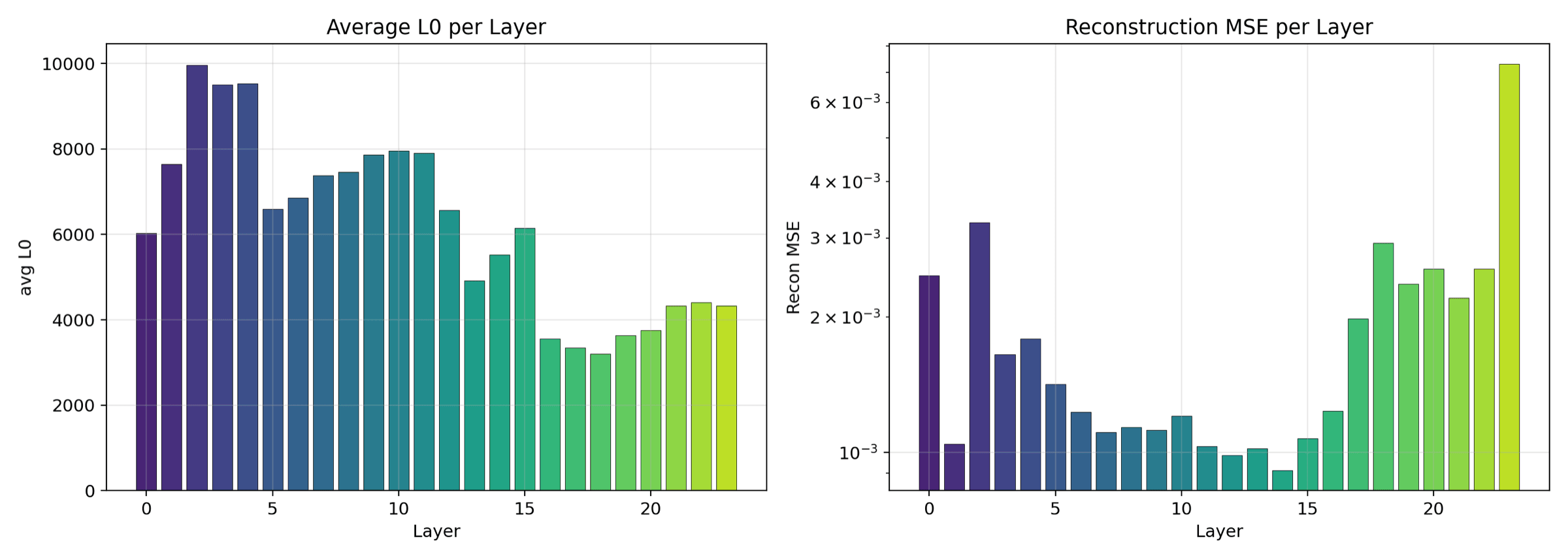
L0 (average active features per token) on one axis, reconstruction MSE on the other. Layers that are naturally denser sit on one side, sparser layers on the other. Reveals which transformer depths need more dictionary capacity.
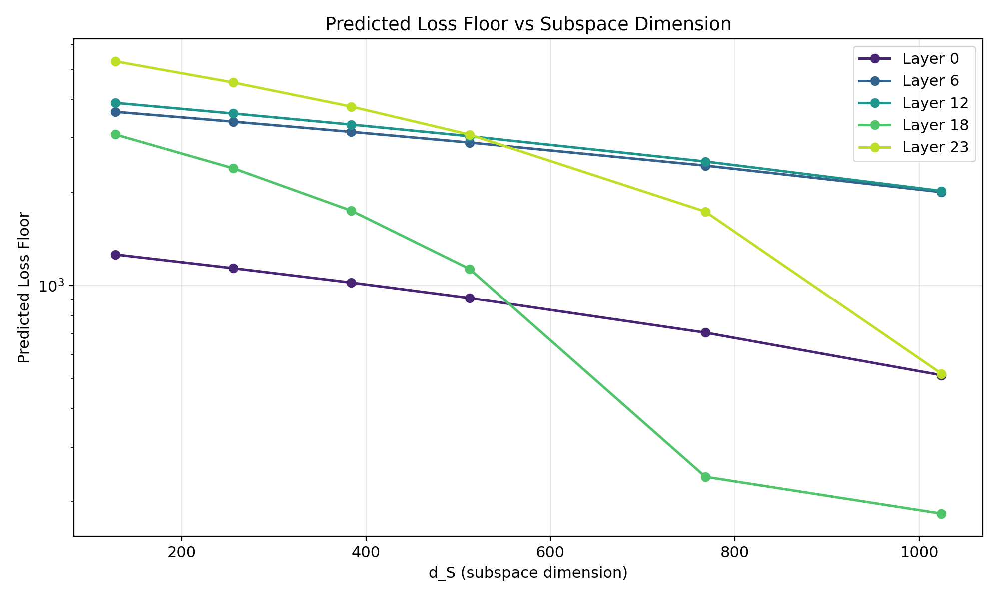
For each layer we sweep the dictionary width d_S and ask theory: where does loss bottom out? This figure draws the predicted curve. Comparing it against the actual training loss is what tells you the prediction is right.
Trial B - L1 = 8e-5 fixed (paper-exact)
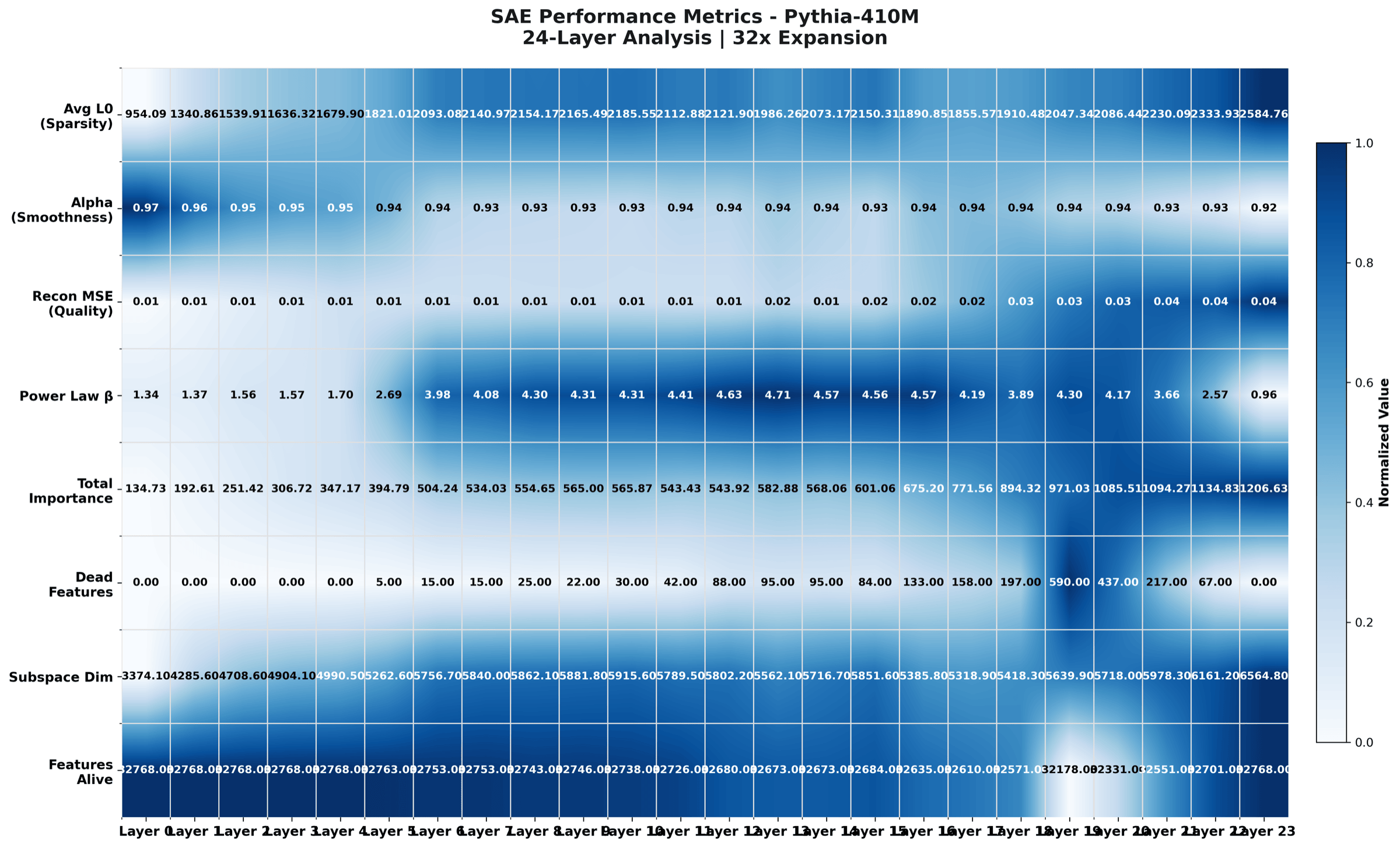
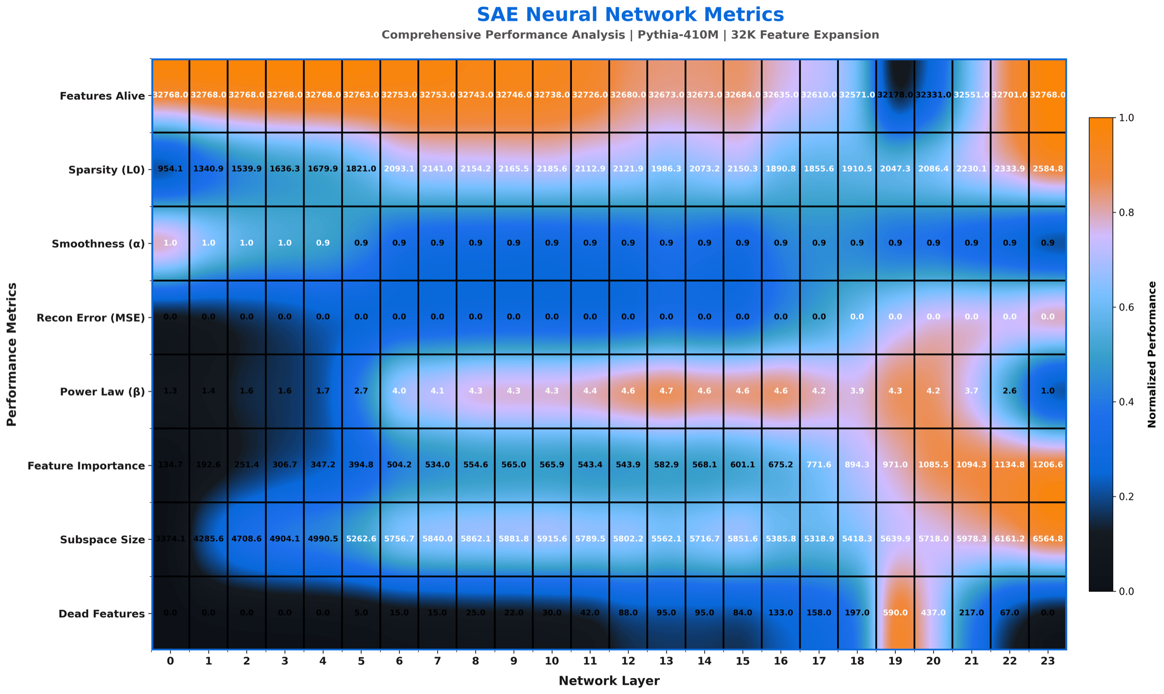
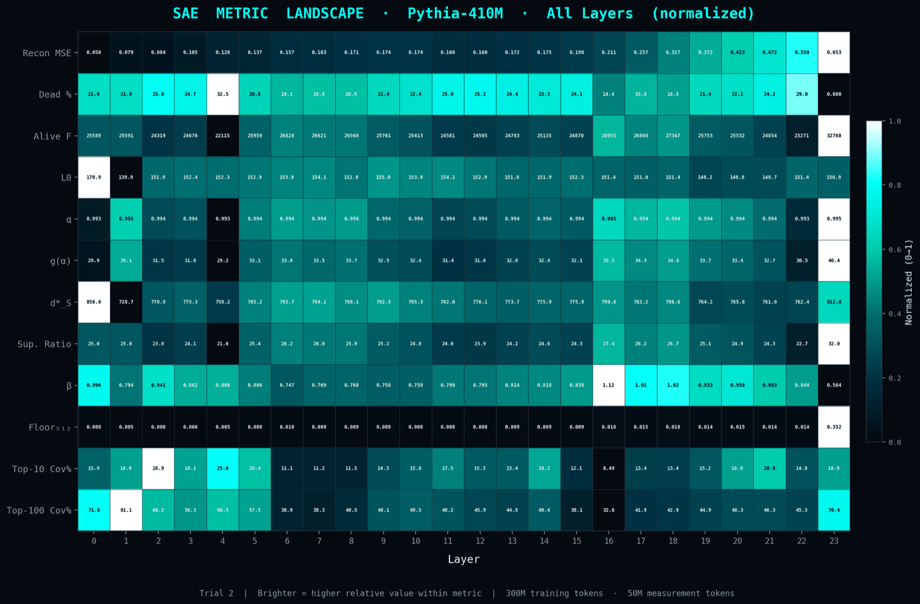
Lowest L1 of the three trials, tuned so the L1 penalty matches the paper-exact sum formula used in the theoretical derivation. This is the trial whose numbers go into the paper's main tables. It also has the richest visual output: seven rendering variants of the same underlying per-layer measurements, generated to support different downstream surfaces (paper, blog, presentation, dark-mode site, social card).
The clean paper-grade rendering of the L1 = 8e-5 paper-exact trial. Rows are layers, columns are SAE metrics. Annotated labels and a balanced palette are why this version was picked as the paper figure.
Same data as the premium heatmap, with a more compact and conservative palette. Built for LinkedIn cards and slide decks. Did not make the paper because the colour band is less expressive at print resolution.
Same data again, but each layer gets a sidecar with its own mini statistics. Used in the paper appendix where horizontal space is not as tight as the main column.
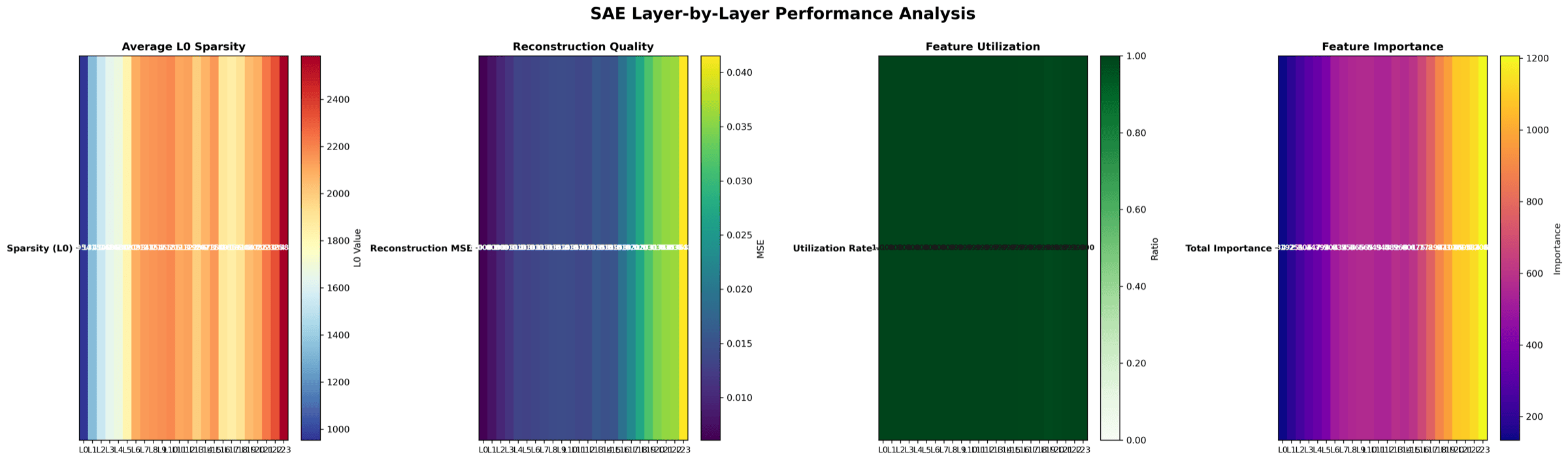
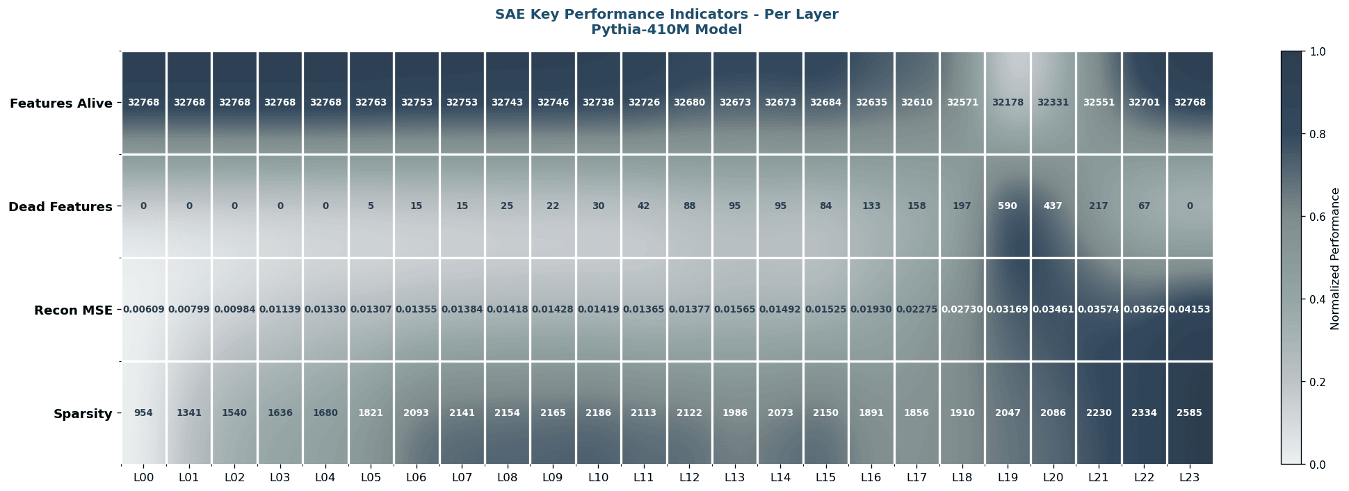
Small-multiples view: every layer's full metric vector tiled onto one page. Useful in show-me-everything talks where the audience wants to inspect each layer in isolation.
Smooth-gradient rendering of the same metrics. Looks great as a blog header, but the gradient hides exact bucket boundaries so it is harder to read off a precise number.
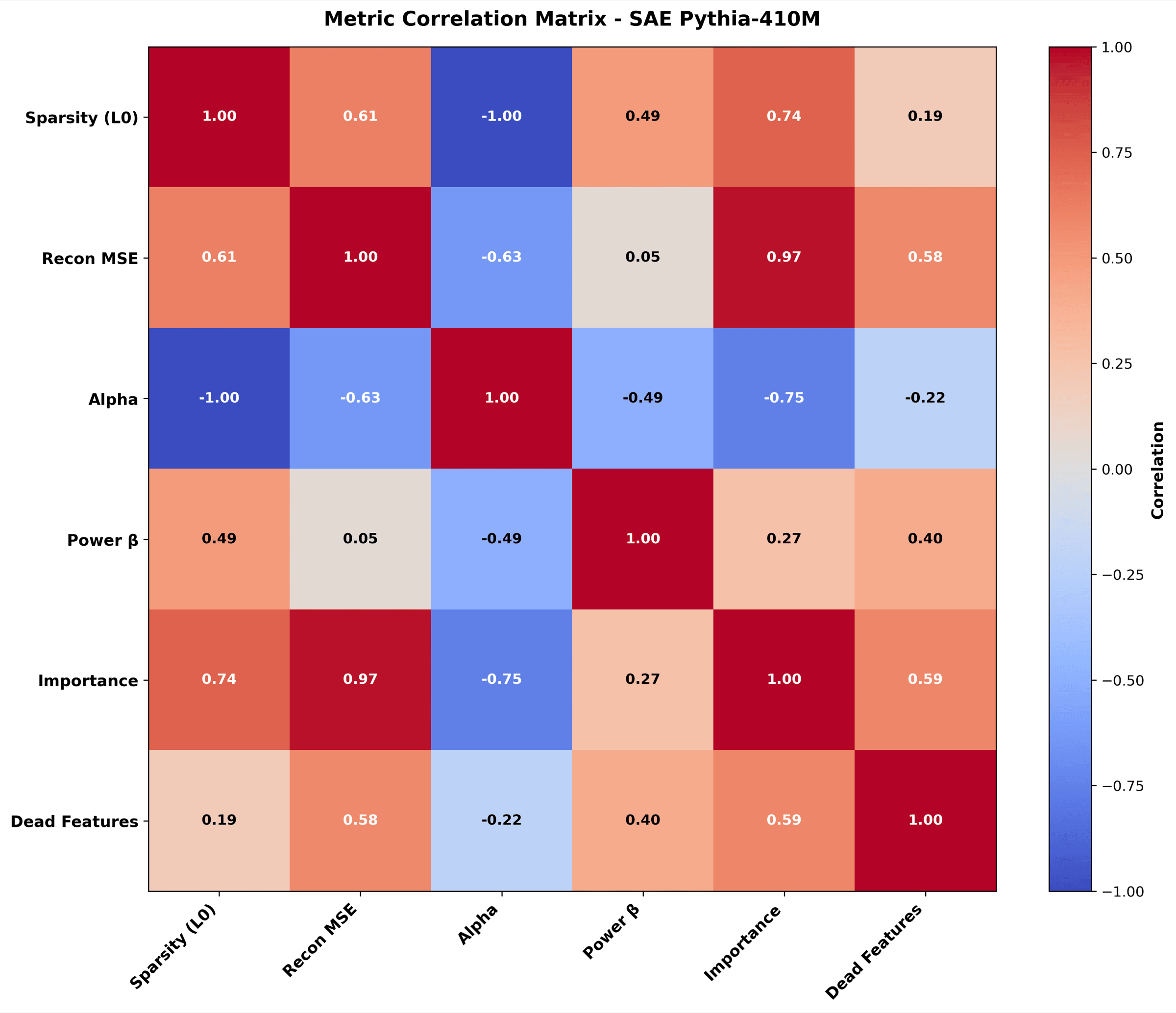
Which SAE metrics move together across layers. For example, alpha tracks dead-feature count. Useful for theoretical commentary about what each metric is really measuring.
Single card with the headline numbers: mean alpha, mean L0, total dead features. Used as the social and cover image, not as a paper-body figure.
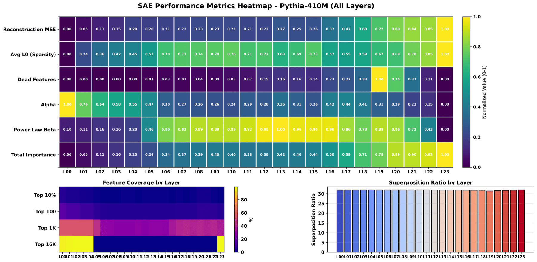
Trial C - L1 = 5e-4 adaptive (target L0 ≈ 150)
The L1 starts at 5e-4 and is adapted layer-by-layer by a proportional controller (rate 0.01) so the average active features per token converges on L0 ≈ 150. Picked for the paper specifically because the controller gives a guaranteed sparsity target - clean apples-to-apples comparison across the three regimes. Trade-off: ~7k dead features per layer (out of 32,768) but the surviving features are far more monosemantic.
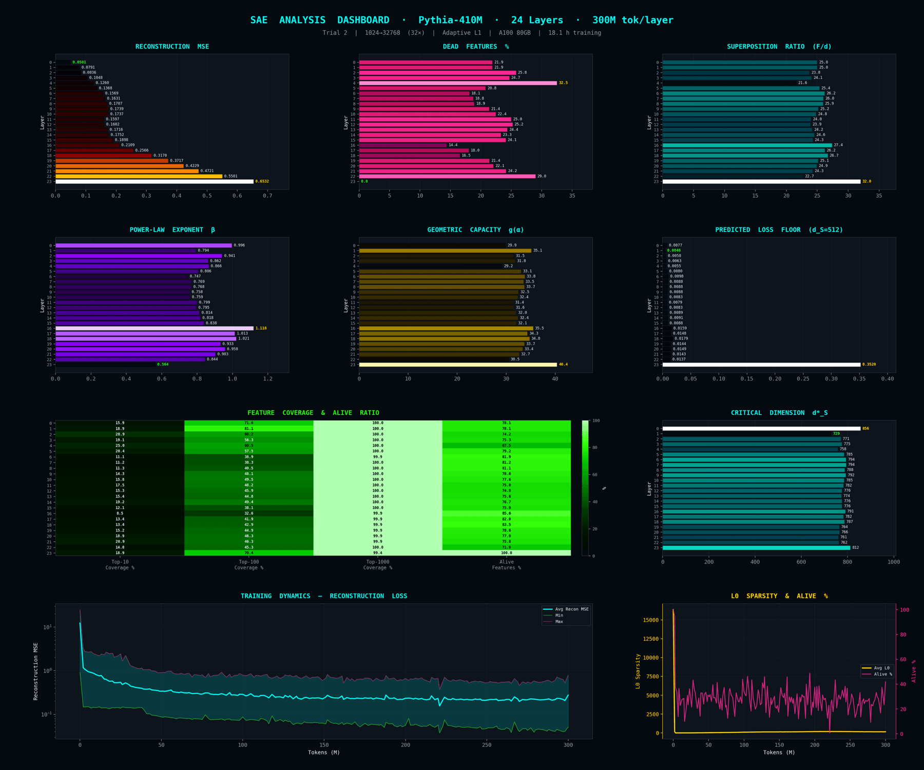
Dashboard view of the L1 = 5e-4 adaptive trial. Composite of alpha, g(alpha), reconstruction loss, dead-feature count arranged as a layer-by-metric grid. This is the figure the paper uses for the comparison panel because it carries hard numbers.
The same per-layer measurements rendered as a continuous landscape so you can read how each property evolves through depth. Qualitative but very quick to scan.
Why these three trials (and not more)?
The three trials are not a random ablation - they were chosen to cover the corners of the sparsity-vs-reconstruction frontier the KD theory predicts: dense (3e-4), paper-exact (8e-5), and very-sparse adaptive (5e-4 → L0=150). Other L1 settings (1e-4, 2e-4, 7e-4) were tried during pilots but discarded - either too close to an already-included trial (no new information) or so far from theory's regime that the KD prediction breaks down for unrelated reasons (e.g. dead-feature collapse).
Reproducibility
Each trial publishes 144 checkpoints (24 layers × 6 token snapshots: 50 / 100 / 150 / 200 / 250 / 300 M) to Hugging Face so the full training trajectory is recoverable:
- L1 = 3e-4 fixed - colm-run-exp-2-t1
- L1 = 8e-5 fixed (paper-exact) - colm-run-exp-2-t2
- L1 = 5e-4 adaptive - colm-run-trial-2
- Toy-model source code (Experiment 1) - exp1/exp1.py
Grokking for Under-Sampled Datasets
A separate, ongoing line of work asks a practical question: can grokking-style training help a model generalize when the dataset is small? Small labelled datasets are the norm in domains like medical imaging, and models trained on them tend to latch onto easy spurious signals instead of the real task. The goal here is to find out whether grokking-favorable optimization can be turned into a usable framework for squeezing generalization out of under-sampled data.
The question. Grokking is the phenomenon where a heavily regularized model, long after it has memorized the training set, suddenly switches to a generalizing solution. If that switch could be induced on purpose, a small dataset might start to behave like a larger one. The experiment below is the first probe of that idea - it does not assume grokking works; it tests what grokking-favorable training actually does to a model's internals.
The setting
The testbed is Camelyon17, a cancer-detection benchmark of stained tissue patches collected from several hospitals. Each hospital stains its slides slightly differently, so a model can cheat by reading the hospital's stain colour instead of the tumour. Training uses three hospitals; the model is then tested on a fourth, unseen hospital - a true out-of-distribution test. To force the under-sampled regime, training sets are deliberately shrunk to 300-1000 images.
What we ran
Eleven ResNet-18 models were trained across two regimes: a grokking-favorable setup (high weight decay, expanded initialization, gradient-EMA filtering) and a standard baseline. Every model was checkpointed throughout training so its whole trajectory - and its internal representations - could be inspected after the fact.
Four ways to look inside the model
Rather than judging the models by accuracy alone, four interventions probe how the hospital shortcut is stored:
- Layer-wise Linear Probing - measuring, layer by layer, how recoverable hospital identity and tumour identity are from the features.
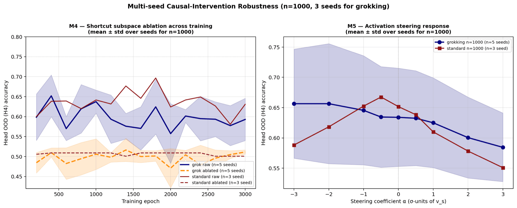
- Subspace Ablation of the Hospital Shortcut - building the subspace that carries hospital information and projecting it out, then checking whether predictions break.
- Activation Steering - pushing the model's features along the dominant hospital direction and watching how the prediction moves.
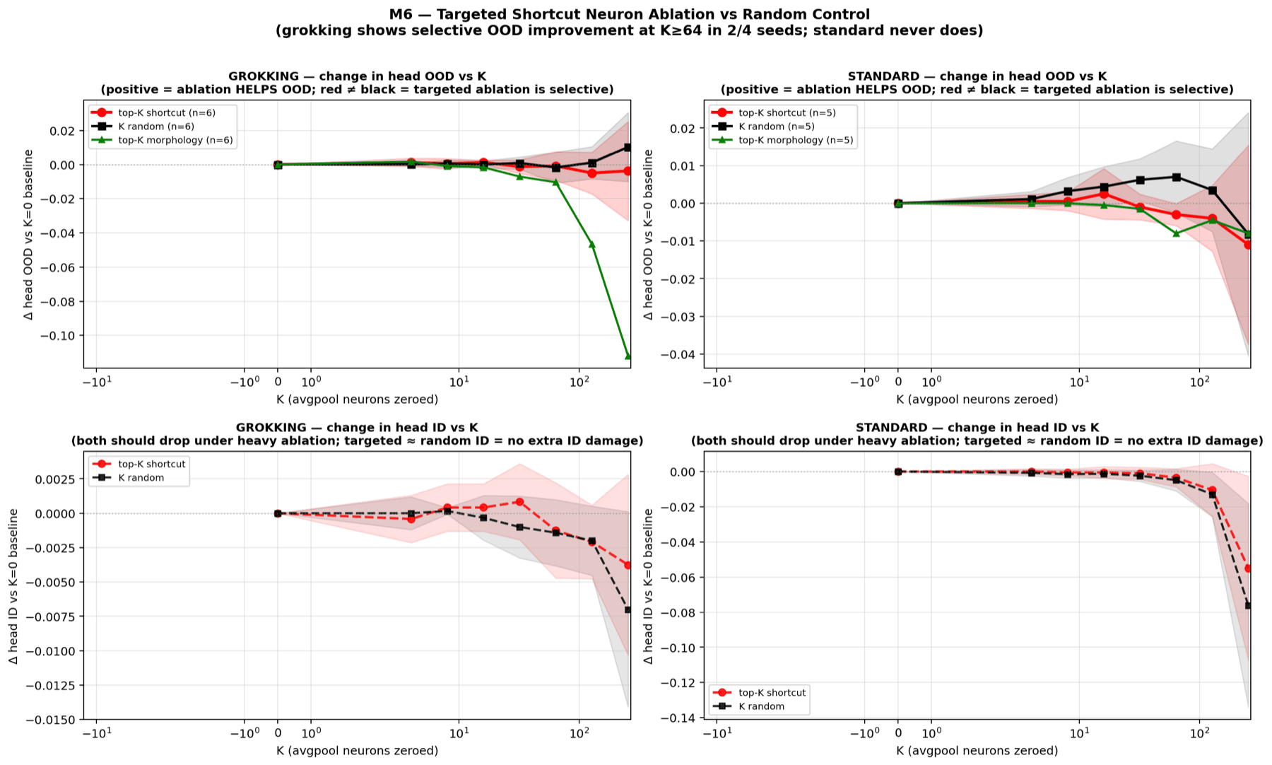
- Targeted Neuron Ablation - switching off the most hospital-selective neurons, against a random-neuron control, to see whether the shortcut is localized.
What we found so far
The headline result is a clean negative: no grokking happened. Across all eleven runs, out-of-distribution accuracy peaked early and then decayed - the opposite of grokking's delayed jump. We call this "ungrokking". On raw accuracy, the grokking-favorable regime did not beat the standard baseline.
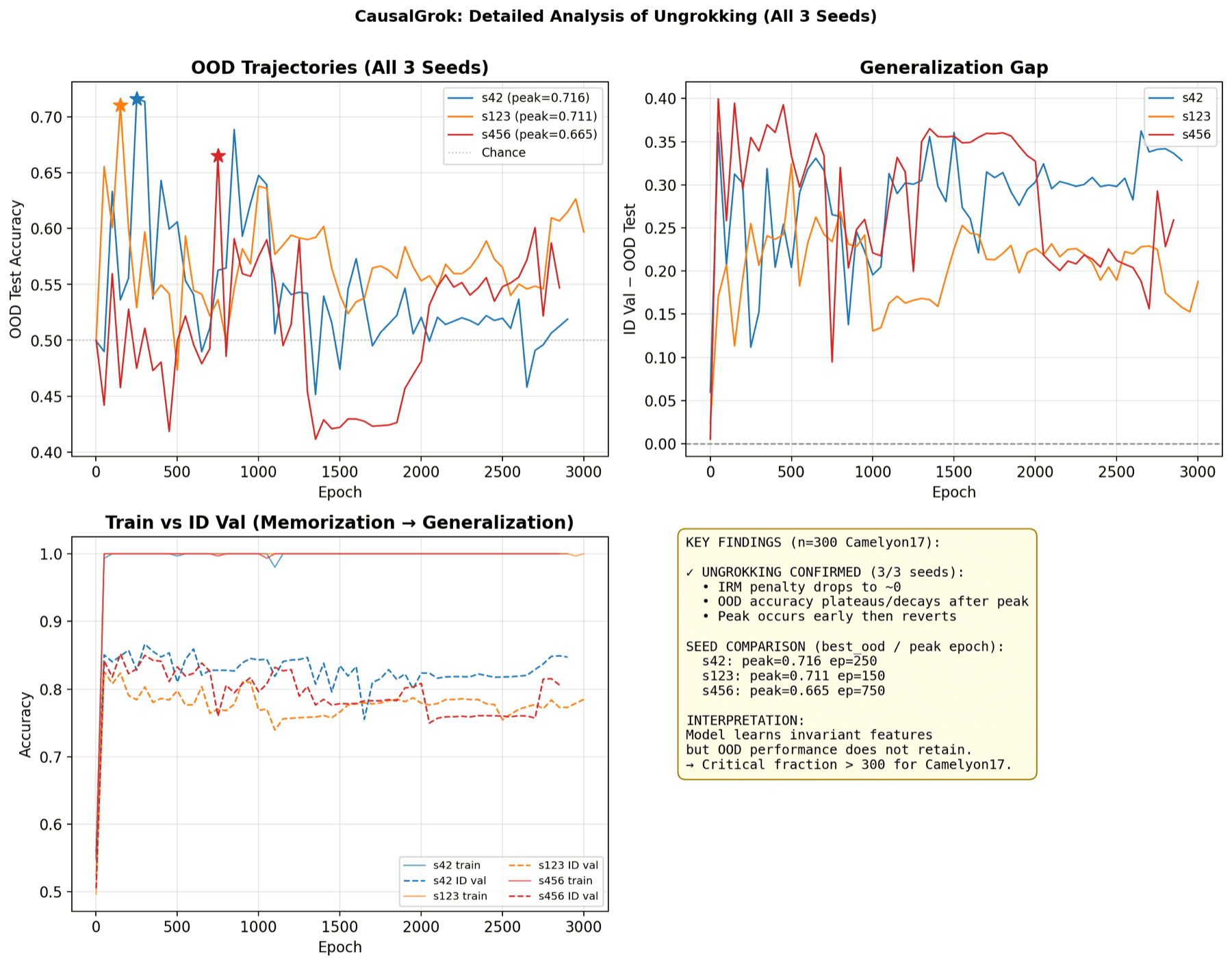
The interventions tell a more interesting story. Even though both regimes generalize about equally badly, the grokking-favorable models appear to store the hospital shortcut differently: their features react in a consistent, steerable way when pushed along the hospital direction (4 of 5 grokking-favorable runs versus 1 of 3 standard runs), and the shortcut looks more concentrated into a small set of directions. The tentative reading is shortcut concentration, not shortcut elimination - heavy regularization compresses the spurious signal into a tidier, more controllable place rather than removing it.
Status: exploratory, and ongoing. This is one slice of a larger effort. The sample sizes are small, none of the intervention results are statistically significant yet, and the training regimes differ along several axes at once - so nothing here is a finished claim. It is written up as a first pass: a reusable suite of interventions, a clear negative on the accuracy question, and a representational difference worth chasing. The next experiments - cleaner controls, and a real test of whether shortcut concentration can be turned into a generalization gain - are in progress.
Read the full deep dive - Grokking for Under-Sampled Datasets →
Why It Matters
Capability is moving fast; understanding is not. Interpretability work is one of the few research directions that scales with capability rather than against it - bigger models give richer internal structure to study, and reliable mechanistic accounts of behavior are a prerequisite for trusting AI systems in high-stakes settings.